Overview
These guidelines outline how to make the BEST possible casual software. This is a broad category of applications, utilities, games and experiences which do not require significant investment of effort from the end user to enjoy. This is software which will delight and engage people. Our perspective on casual software can be broken down into three key concepts.
1) Function – Purpose delivered with a minimum of features
2) Gestural – Minimal interfaces, using physics and direct manipulation
3) Cinematic – Playful Interaction Design, Art/Sound design and effects

Function is the backbone and there is a balance which must be reached in designing an experience which delivers the key purpose without weighing the user down in options, learning, terms, menus, dialogs or steps.
Gestural is all about providing a great experience the first time, and each time thereafter. Gestural should be a contrast to tiny atomic GUI’s with many, many small buttons and menus. Gestural is all about broad simple motions whatever the input devices. This means minimal interface, obvious purpose, broad motions and clear feedback.
Cinematic is great presentation, providing animation on completion of actions and providing a clear state and flow for the experience. We want out users to know what they are doing and where they are.
Software is achieving these three points when a user can start an application for the first time, understand its purpose and intuitively use it. The software should feel natural, be able to be explored without fear, clearly illustrate actions that the user initiates and look and sound great.
Gestural introduction
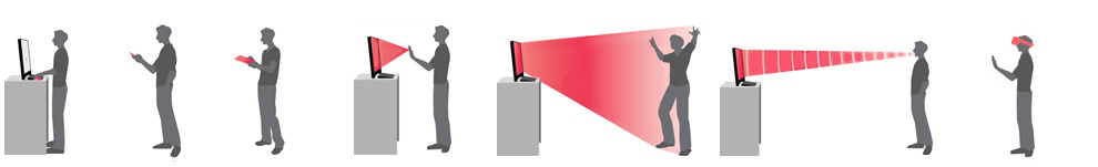
The continuum of interaction for NUI interaction is very large. NUI (Natural user interfaces) describes a range of philosophies which center on making the user interface invisible and obvious. NUI interfaces can be used with many input devices including keyboard, mouse, touch, multi touch, near touch, voice, pen, gaze / eye tracking, 3D input, VR, AR and mixed reality (XR).
The use of machine learning, machine vision, speech processing, big data queries and natural language processing are all part of making these inputs seem to be more natural as we can increasingly take more types of ‘human’ input.
To achieve the goal of gestural software;
Broad motions are important. This means users should be able to use software by sweeping or touching with mouse, hand, pen or finger. They should not be required to find and locate very small parts of the screen. Double clicks and right clicks are for shortcuts or accelerators only, not for core functions.
Minimal interfaces have a small number of elements and they present a clear purpose. Generally this means when designing a layout to be reductive, reducing the number of individual elements.
To allow for applications which still present very rich content use should be made of compound elements. While these exist as only one element on a layout, they can contain many homogeneous content items which behave the same. An example would be a grid or glass shelf containing many album covers.
In terms of interaction with a compound object these usually support more content than is visible at first glance, often supporting navigating through scrolling, panning or zooming. This means the individual items within the compound element should be limited to being able to be selected – this means they will not conflict with any navigation.
Tactile interfaces provide a very important mental connection to the physical world for users. There are three ways we work to improve the ability of our applications being more tactile.
1) Direct Manipulation: two fingers to resize and rotate, multi finger crumple gestures, dragging, pointing and flicking – essentially providing the user with a direct rather than abstract interface.
2) Physics of momentum, friction and elasticity: This is where elements in an application can slide, bounce, and move in the way users are used to seeing in the natural world.
3) Enveloping: This is modulating an action based on a variable input such as pressure/angle of a pen input or the proximity/area of a finger. This can result in natural effects like line thickness while drawing or the volume of a virtual piano key. This adds significant richness to user interactions.
Ergonomics are very important to applications being approachable. Just like in the process of designing physical products, the layout, size and interaction of elements/controls is very important.
Each type of input sensor that a user may choose to use has different trade-offs and limitations with the human body and the environment the interaction occurs in. For example requiring people to hold their arms up on a large wall mounted touch screen can cause fatigue, requiring a user of a phone to pick out small areas is frustrating and putting the save button right next to new game might drive people mad.
Delight users with actions which seem almost like magic. Wonderful physics touch interactions can bring an experience to life. A technique like ‘look & speak’ seems to be reading your mind. With ‘look & speak’ or ‘look & gesture’ the system tracks the object you have fixated on – presents a highlight so you know it has detected your gaze – and then accepts a voice or gesture input to act on that object. Either for large screens or inside a VR headset this ability to just look and act with context really makes the user feel in control of the experience.
Testing with external users can be very valuable. Testing internally is also important. It’s even better when your own QA, developers, designers and artists can be users of your software.
Another big challenge in ergonomics is the increasing layout challenges of different resolutions and aspect ratios on phones, tablets, notebooks, desktops and consoles. This is a significant task to manage laying out content so it is easily consumed and to make the interface handle these changes gracefully. A snapping and reflow system along with content scaling which can respond to physical display dimensions is a critical tool. It should allow suitable designer control to make specific adjustments as required for the wide variety of devices now available.
LINK Gestural guidelines
Cinematic Introduction
Performance over 60fps frame rate and 0fps idle frame rate is our goal. Make things fast and smooth when we are using them and drop the app down when we are not.
Touch, file, audio, network and memory latency are always there. We need to work to understand and minimise these within the engine as much as possible – then to come up with guidelines for app developers where performance gains can be made.
Database – use transactions, use in memory mode for inner loops
Images – stream images, provide levels of detail
http – use async mode and show users a progress indicator
State is a really important thing to communicate to users. It might be the pen selected in a painting program with a clear highlight, and perhaps pulling it out of place. It may be a choice is being presented so we need to refocus the user on the foreground and drop out the background. By making state, and the resulting choices or action options really clear users will find our applications more intuitive and less frustrating.
Actions are often how we get things done in applications. We need to think about how we can show users these actions have been performed with direct feedback. It might be animating photos into the slideshow when you flick them, it might be having a photo disappear into particles when you delete it, it might be an animation of photos going into a cloud when you upload, but making actions clear as to their behavior and successful usage will make users much more comfortable with the application. The aim is to make this action feedback fun rather than annoying and certainly not to slow the user down.
A key issue with many chat interfaces and NUI interfaces is there is no discovery mechanism for actions. It’s really important that the application can show the things a user can potentially do with the item they are interacting with. Consistent vocabulary for hover labels, iconography and previews of actions are all powerful tools in helping users understand the potential of actions.
Consistent is important. We need to strive to share metaphors and components across our families of applications. It’s important we provide a consistent mental model for users. When they reach out and touch a screen we want it to work the way they expect.
Rich Content is appealing. We need to try to bring our content, our partner’s content, our USERS content to the front and center. Full screen views of family videos, large thumbnails when browsing through files, great movie trailer posters filling the screen. Large amounts of interaction overhead is a burden on users, large amounts of (appropriate) content to browse is enjoyable and enriching.
Conversational interactions are now possible with AI systems and having appealing voice and text interactions which are discoverable and consistent with clearly executable and reversable actions is a great addition to any user experience.
Worlds are an important part of the human brain. We remember where our street is, where our place is and where our room is. This does NOT imply we make big villages to navigate – the abstraction of the getting to the web in a browser rather than having to walk down a virtual hallway to the library is clearly a benefit. Actually 2D planes are still our best interaction model with a 2D screen. The premise is that 2D workspaces can be layed out in a 3D space and transitions can be used to help user build a mental model of where they are in the overall space.
e.g. as you select a sub folder the previous folder animates past the camera and you appear to drop one level deeper into the hierarchy. Then pressing up a level will animate back. This provides users with a strong mental model to understand they are going in and out of a file system.